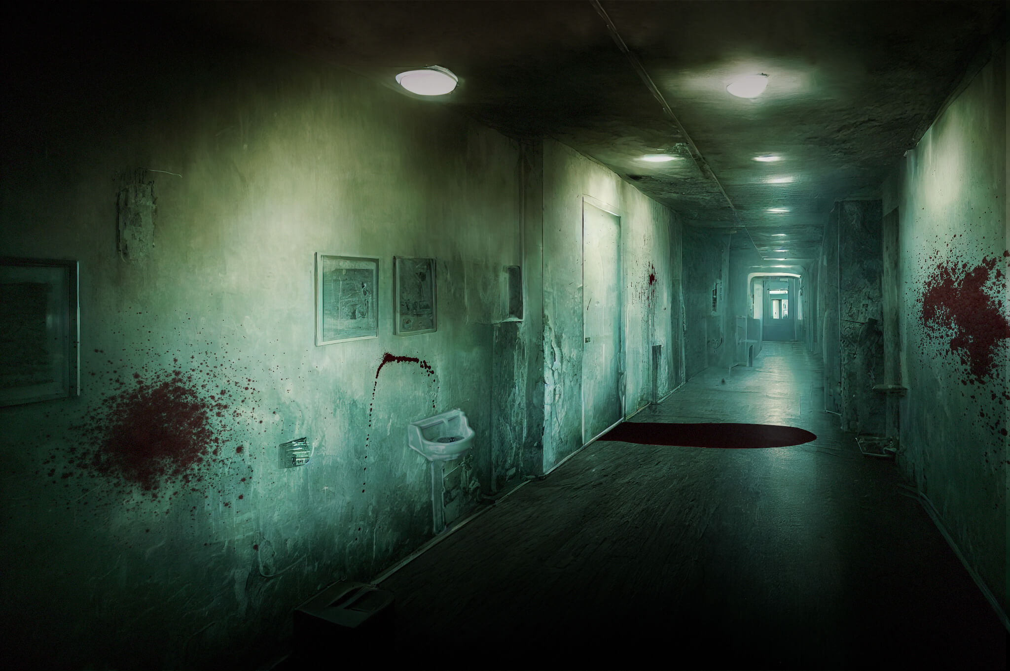
Compositing Blood In Nuke
Tips and tricks for mastering one of the more frequently encountered compositing tasks…

Tips and tricks for mastering one of the more frequently encountered compositing tasks…
The topic for this guide was suggested by one of the Companions in our community:

“An article regarding compositing blood could be an interesting topic! 🩸”
Vital Knowledge
There’s a handful of tasks which you’ll repeatedly come across in your compositing career.
Things like adding smoke, muzzle flashes, or dust hits to a scene are typical ‘bread and butter’ work that every compositor will encounter.
Compositing blood is one of those common tasks.
That’s because visceral violence is a popular tool for adding action and excitement to a scene. Movies and TV shows will frequently have actors and extras getting shot, punched, stabbed, cut, blown to pieces, or sliced and diced in any which way.
And, it’s up to us to add blood to, or to augment the practical blood in, these often intense scenes.
So, knowing how to composite blood in a realistic way is a crucial skill to have as a compositor.
Types Of Blood Work
There are many different variations of blood that can be added to a shot, each with different characteristics (like for instance motion, colour, or density).
For example:
- Spray
- Splatter
- Splashes
- Mist
- Pools
- Drops
- Streaks
- Streams
- Blood in water
- Bleeding wounds
- Blood hitting the lens
- Smudges/smearing of blood
- Pulsating blood (decapitation, etc.)
- Gore (bloody flesh, skin, tendons, etc.)
- Blood-soaked clothing/fabric, often combined with ripped cloth
- Blood hitting walls or objects and leaving a pattern (bloodstain texture)
No matter what kind of blood element you’re compositing, as a basis, all the standard compositing rules apply.
– Things such as:
- Tracking the blood to the camera’s and/or to the object’s movement, making sure that the blood sits at the correct depth plane in the scene.
- Adjusting the depth cues, like perspective, scale, and parallax, to sit the blood into the scene.
- Matching the dynamic range of the blood element to the scan.
- Adding lens and sensor effects to the blood element, like lens distortion, depth of field, and chromatic aberration, to match what’s happening in the plate.
- Adding motion blur to the blood to match the camera’s and/or the object’s movement.
I’ve written in detail about those things before, so please follow the links above if you’re curious to learn more.
For this guide, I wanted to focus more on blood-specific tips.
Visual Impact
Blood hits are all about visual impact.
And, particularly in fast-moving action scenes, blood spurts can easily get lost in the chaos.
So, you’ll often have to art direct the blood:
Make sure to position the blood in the frame in such a way that you maximise the visual contrast against the background.
Try to have dark blood go over a brighter part of the background, and bright blood go over a darker part of the background.
Adjust the direction and the angle of the blood so that its silhouette becomes more clearly visible and readable.
Take the frame below from Deadpool & Wolverine, for example. Had all of the blood been angled down, going over Deadpool’s dark and red outfit, it would have been much more difficult to read.
Instead, by having a large portion of the blood shoot up and over the bright, snowy background, we get the visual contrast that’s needed for the audience to be able to read the blood.
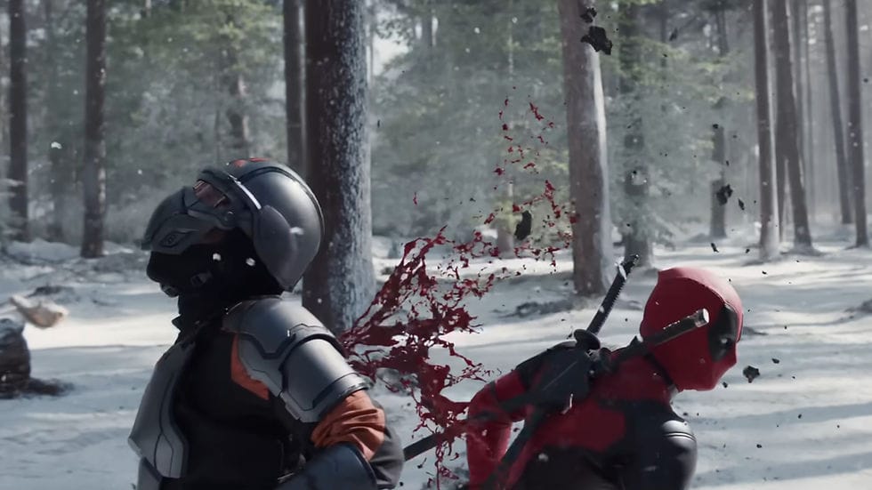
Blood hit from Deadpool & Wolverine.
Sometimes, it can help to add a ‘ping’ – a dynamic specular highlight – to the blood, in order to draw attention to it for a brief moment. (When it makes sense according to the lighting conditions in the scene).
And, if the motion blur on the blood is very strong and is making it too transparent, you can thicken up the alpha of the blood to compensate.
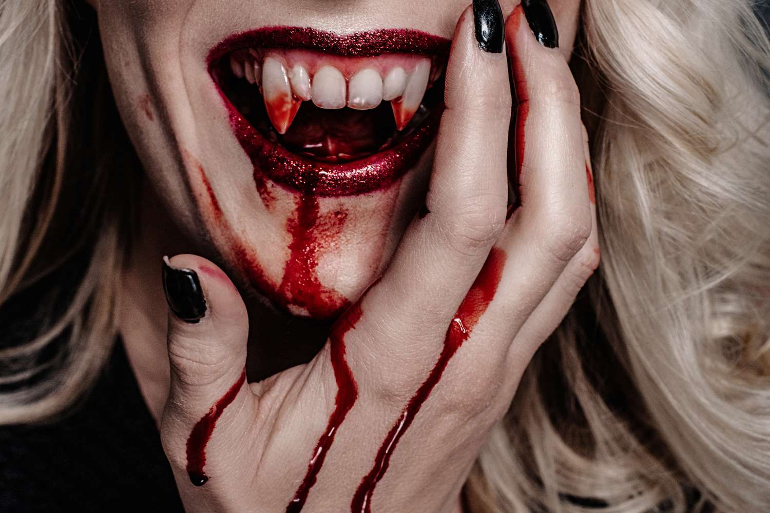
Blood Colour
In the red blood cells in our blood there is a protein called hemoglobin.
This protein contains iron, which facilitates the transportation of oxygen in our body.
When blood is in the body, it’s either carrying oxygen (oxygenated) or has released oxygen to the body's tissues and organs (deoxygenated).
Freshly oxygenated blood has a bright, rich red colour. (Typically carried away from the heart to the body’s tissues and organs by the arteries).
Deoxygenated blood has a darker, more maroon (brownish red) colour. (Typically carried back to the heart from the body’s tissues and organs by the veins).
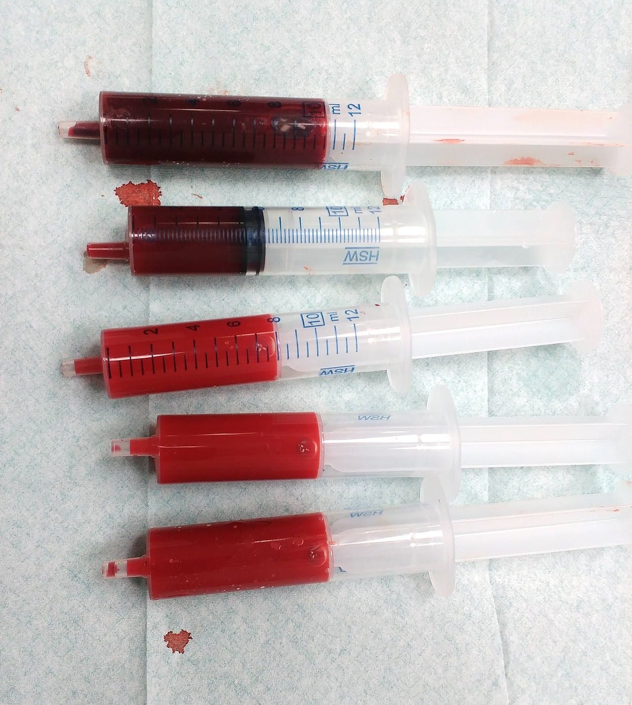
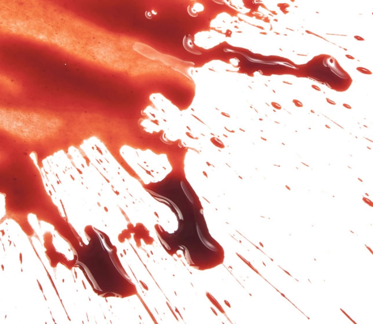
Venous (darker) and arterial (brighter) blood.
When blood is exposed to air, hemoglobin binds to oxygen, causing deoxygenated blood to become a brighter red.
Over time, as the blood dries, the hemoglobin breaks down, and the blood can darken further, eventually turning brown or even blackish.
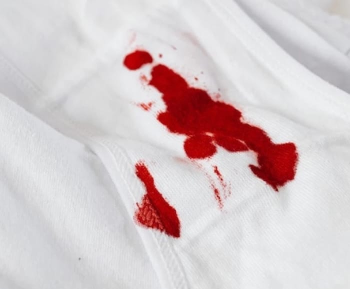
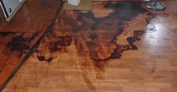
(1) A fresh bloodstain: the blood is bright red. (2) A somewhat aged bloodstain: the blood is still red, but turning darker. (3) An aged bloodstain: the blood has turned brown in colour. (4) An even more aged bloodstain: the blood has turned black in colour.
So, fresh blood that is leaving the body (blood spurts, fresh wounds, etc.) should have a bright red colour. And blood that’s been outside of the body for some time (blood stains, pools of blood, etc.) should turn more brownish black.
However, as always, take into account any colour cast in the plate when grading the blood. To integrate blood into a cool, dark night time scene, you may have to add a blue tint to it, for example.
When grading the blood, be careful so that you don’t tint the specular reflections too much. If the light in the scene is bluish and you accidentally tint the specs orange-yellow, the blood can look out of place. – You can isolate the highlights with a luma key to grade them separately.
Just like with explosions, blood should often be less saturated than you might think. In fact, it’s a very common mistake to grade blood overly saturated red. So, make sure to take cues from the saturation levels in the plate.
And, make sure to match the lighting and shadows in the scene:
Light & Shadows
Just like when compositing any other element into a shot, make sure to match the direction, colour, and intensity of both the lighting and shadows of the blood element to the scan.
When you’re working with CG blood renders, you have a lot of leeway to adjust the lighting in the renders to fit the lighting conditions in the plate.
With 2D elements it’s a bit trickier, but you can still do some relighting – for example using tools and setups such as this one:

– Just be careful not to push it too far, making the blood look too processed and unnatural. A common mistake is to make the blood look embossed or debossed.
Let’s take a look at how blood reacts to light, to give us a better idea of what to aim for when lighting and grading it.
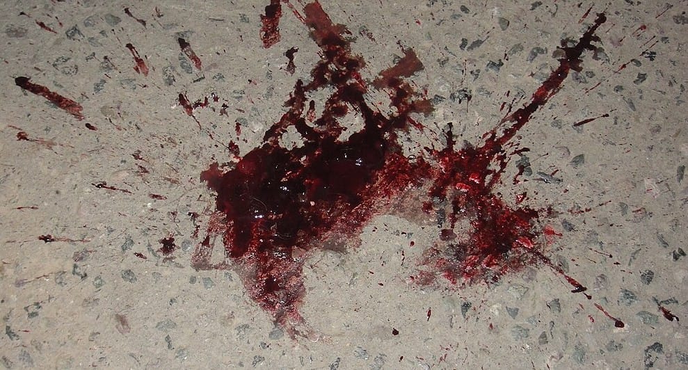
Blood splatter.
We can pinpoint some characteristics of blood from studying the image above:
- Blood isn’t very transparent – we can only really see through it when the layer of blood is very thin. E.g. at the top screen left in the image above. (Or, when the blood is very strongly backlit).
- In areas where there is a thicker layer of blood, the colour looks darker. More of the light is being absorbed and scattered within the blood. E.g. in the cores of the three ‘arms’ above.
- Fresh (wet) blood has a reflective coating which catches a lot of specular highlights. E.g. along the edges of the blood above. Blood will begin to clot within a few minutes, forming a dark, shiny gel-like substance that grows more solid as time progresses. And so the older the blood, the less shiny it will be.
- Blood is thicker and more viscous than water, and ‘sticks’ to itself – forming areas with larger drops and pools of blood. E.g. in the three ‘arms’ above. – Which creates a thicker layer of blood in those areas, making the blood darker there.
- When blood hits an object (e.g. a wall or a floor), it smears out, creating tails or spines in the direction of travel. (See: bloodstain pattern analysis. Also, here). E.g. the three ‘arms’ and the small droplet streaks above. So, when compositing a blood splatter texture element, make sure to place it the right way around in relation to where the blood is coming from.
Realistic Motion
Blood is affected by gravity.
When you have blood that shoots out to the side in an element, you may have to animate it to fall down in a realistic way in your shot.
Many 2D stock blood elements are filmed in slow-motion, and will need retiming to bring them back to normal speed. When doing so, remember to account for the (now) lack of motion blur.
And since blood is more viscous than water, it will typically run more slowly down a surface. (It also won’t bead as easily as water drops do).
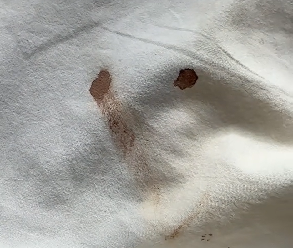
When blood is soaking through fabric, the stain usually won’t expand in a perfect circle. Make sure to break up the roto shape that you’re using to reveal the blood, if you’re going down that route. (Ideally, find an element of fabric getting soaked naturally).
Speaking of fabric, if you’re tracking blood onto a t-shirt or other clothing with wrinkles, the Smart Vector Toolset is great for getting the blood to stick in a realistic way.
You can also warp the blood element to flow along a path using the SplineWarp or GridWarp nodes, for example – just be careful to avoid getting pixels that look stretched.
Other Lifeforms
Different lifeforms can have a different blood composition than ours.
Horseshoe crabs, for example, have hemocyanin in their blood instead of our hemoglobin.
Hemocyanin is a copper-based (as opposed to our iron-based) respiratory pigment, which turns their blood blue:
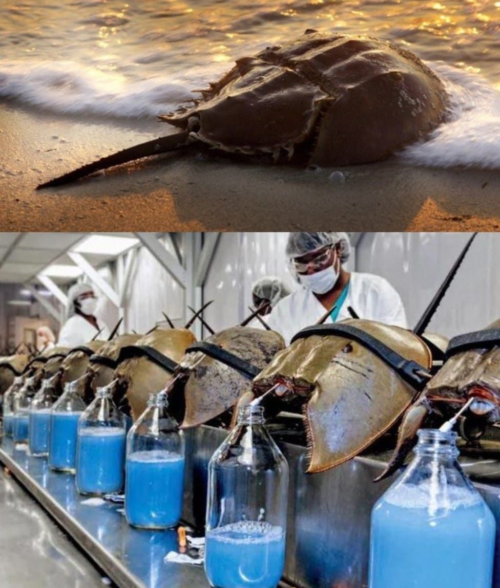
Horseshoe crab blood is blue.
And, there is a whole range of different blood colours in different species. So, if you are for example compositing a blood spurt coming from an alien that’s being shot, you may have to change the colour of the blood.
To do that, you can still use regular, red blood elements, but then change just the hue as described in the Hue section of this guide.
Resources
There are plenty of online element libraries where you can download blood elements.
Here are a couple of free ones:

You can also shoot your own blood elements using fake blood.
There are many recipes for fake blood, for example using corn syrup, red food colouring, a small amount of blue food colouring to give the blood some authentic colour, and some cornstarch to thicken it up and stop it from being transparent.
Here are some variations:
Lastly, to make blood look real:
Study Real References
Try to study real, authentic references (e.g. medical procedures) – and/or use real stock footage and images of wounds – and then mimic how that real blood behaves.
Just be careful when searching online for this stuff.
I hope you found this tutorial useful. For more Nuke tips & tricks, see Nuke.